PollyTM – A cloud platform for finding metabolomic biomarkers
An end to end metabolomic target identification platform for multi-omics data

Overview
Did you know? It takes 10-15 years for a new drug to come to the market and it costs almost a billion dollar. Elucidata at its core is trying to reduce the time to find the target for a drug and thus reduce the cost.
PollyTM is a one-stop solution for finding insights from metabolomics experiments. The traditional way of analyzing metabolomic dataset is lengthy and broken. An expert with 3-5 years of experience takes a week to analyze a dataset acquired from an experiment.
Goal
To design an MVP for end to end metabolomic data analysis.
My role
User Research
Visual Design
User Testing
Team
Ananya Mukherjee (Design Mentor)
Aman Parnami (Design Mentor)
Tools
Sketch
Invision
Duration
8 Months
The challenge

Once the data is acquired from the metabolomic machine. The scientist job becomes a nightmare. He has to convert the files, choose the right parameters for that, once converted, he has to check for quality & noise, annotate metabolites, again run quality check, and visualize the data.
All of these these happen in a very unstructured manner and things get lost in the process. A scientist core job is to form a hypothesis, design experiments, prepare sample, and run is correctly. Avoiding any chances of error. But, often they are doing non-core job that eats up about 80% of their time.
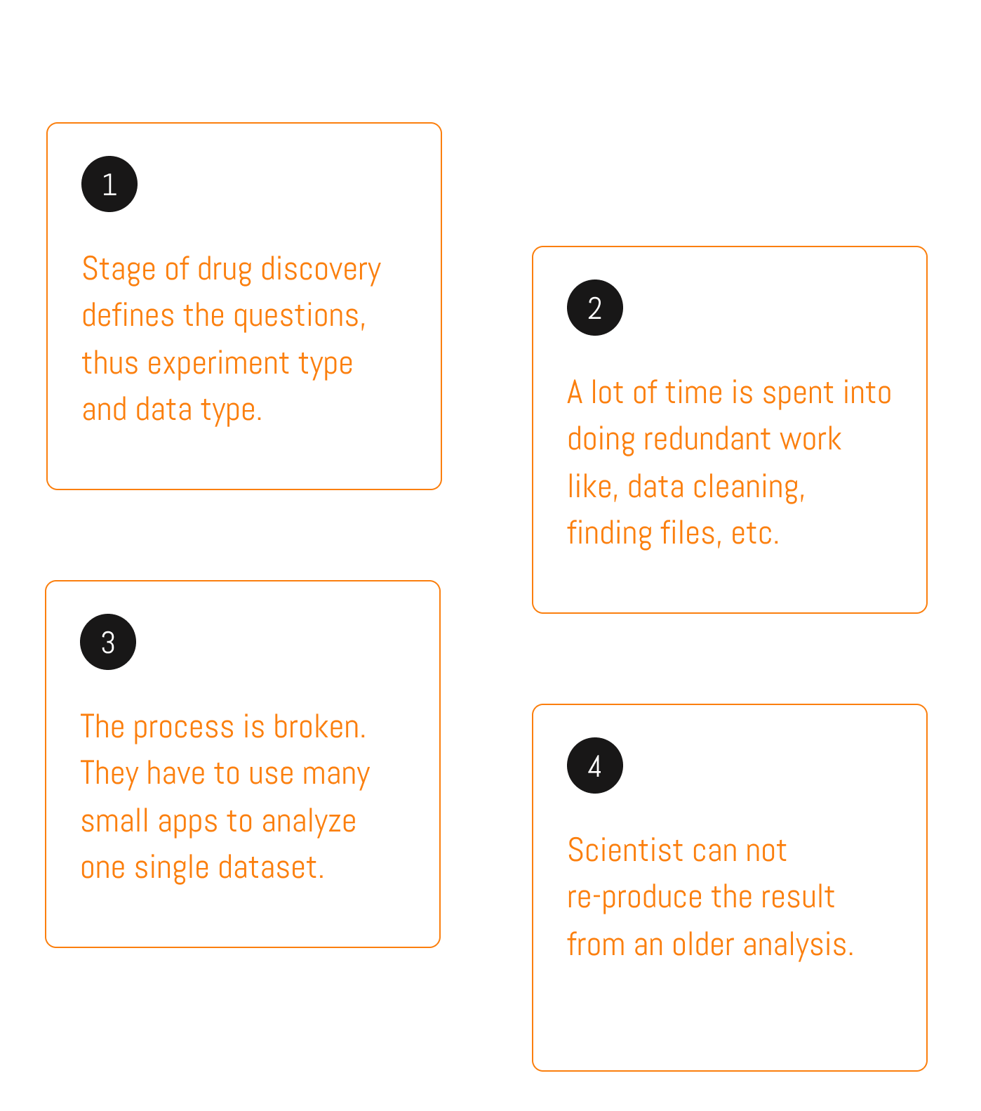
A lot of research work has been done to identify above challenges and to come up with the solutions that you see below.
Want to know more about that? Send me an email.
Email Niranjan
The Solution
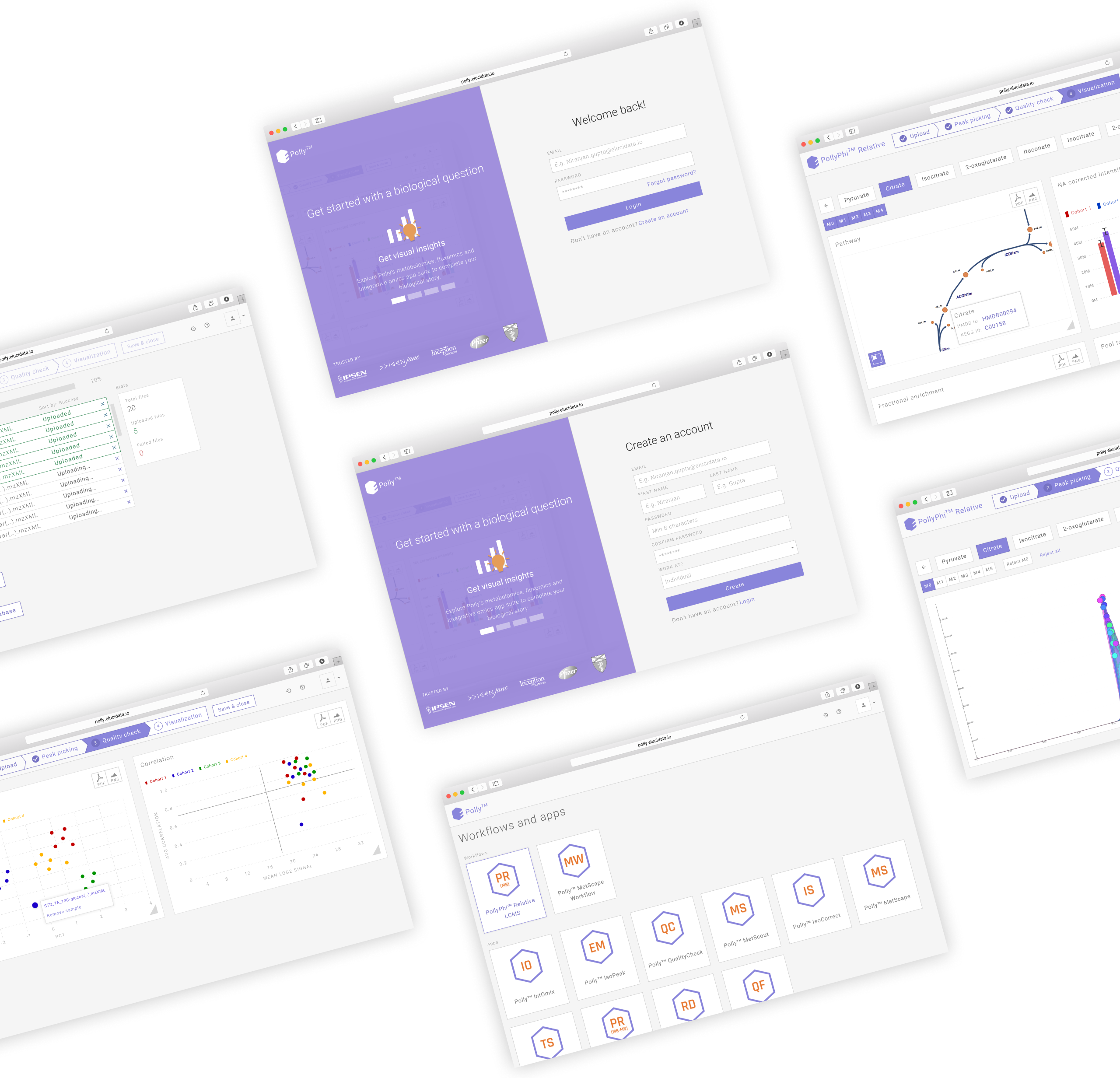
Detailed screens and features
Apps & Workflows
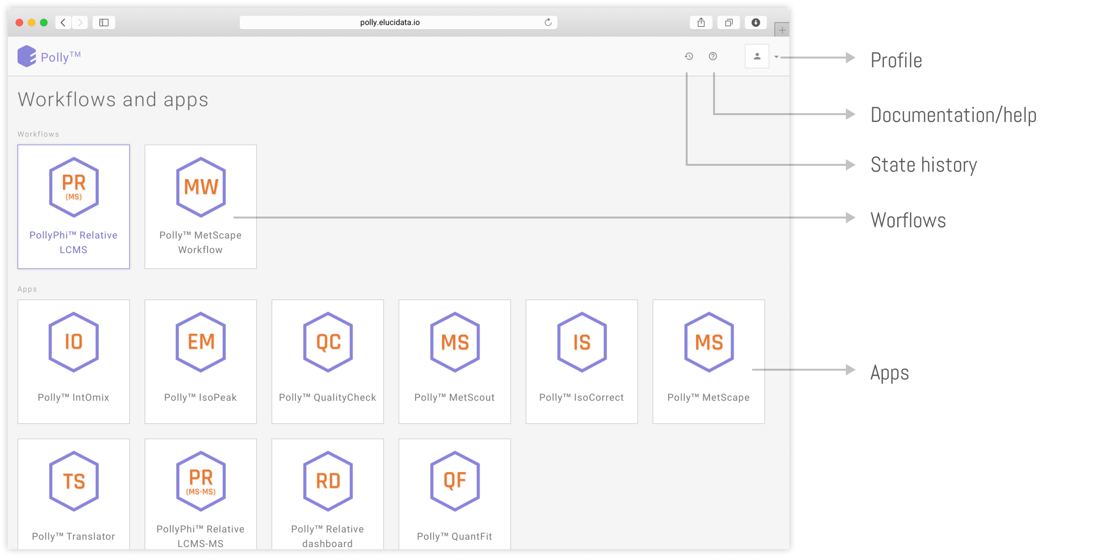
I designed two workflows and several apps based on our findings. Workflows are combinations of apps in which you can go back and forth and iterate quickly. Whereas apps are standalone and serve a specific need.
Upload
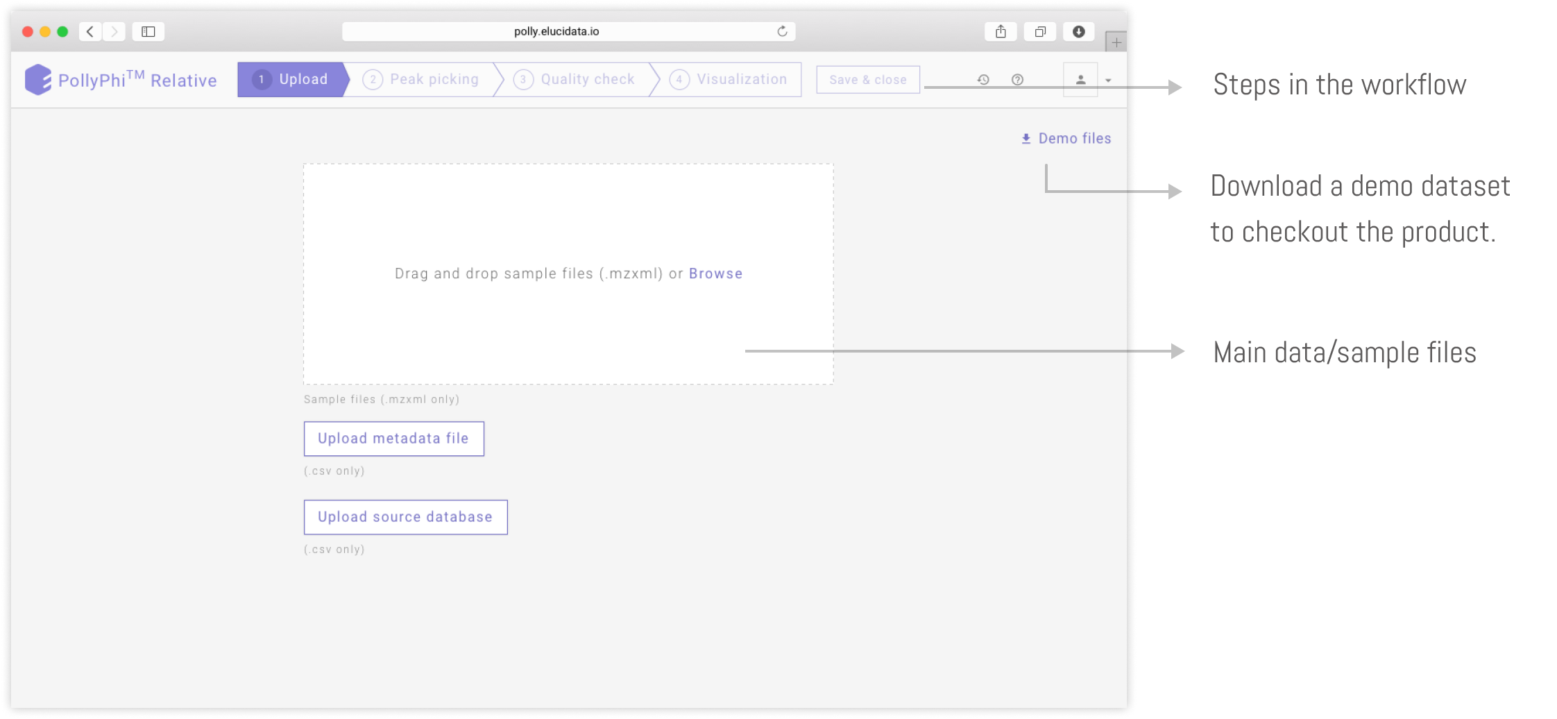
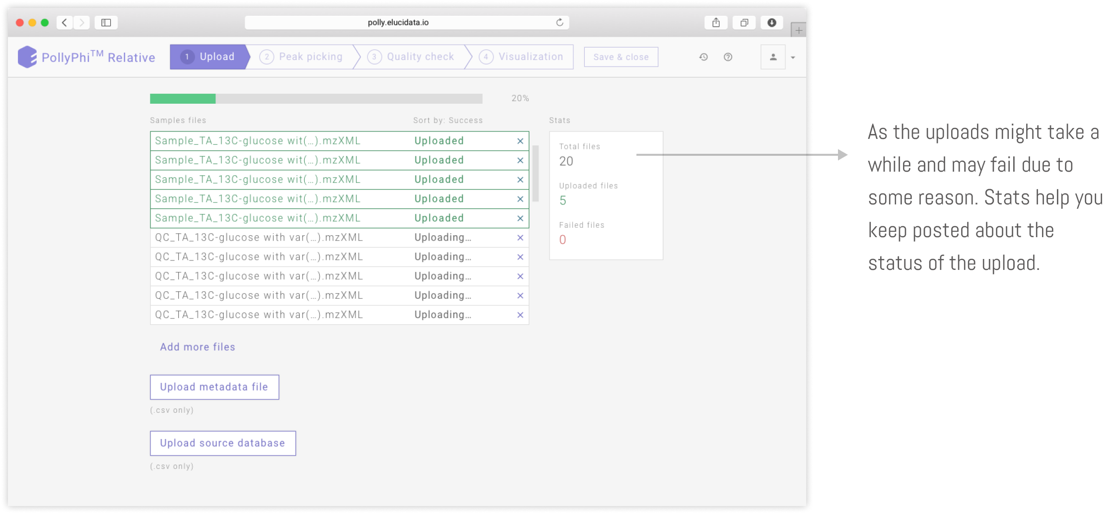
As datasets generated from the experiments can be in GBs and may vary in numbers ranging from 50-100s of files. It was important for me to take care of edge cases like these. Along with the main dataset. A scientist can also upload metadata file and source data file.
Peak picking
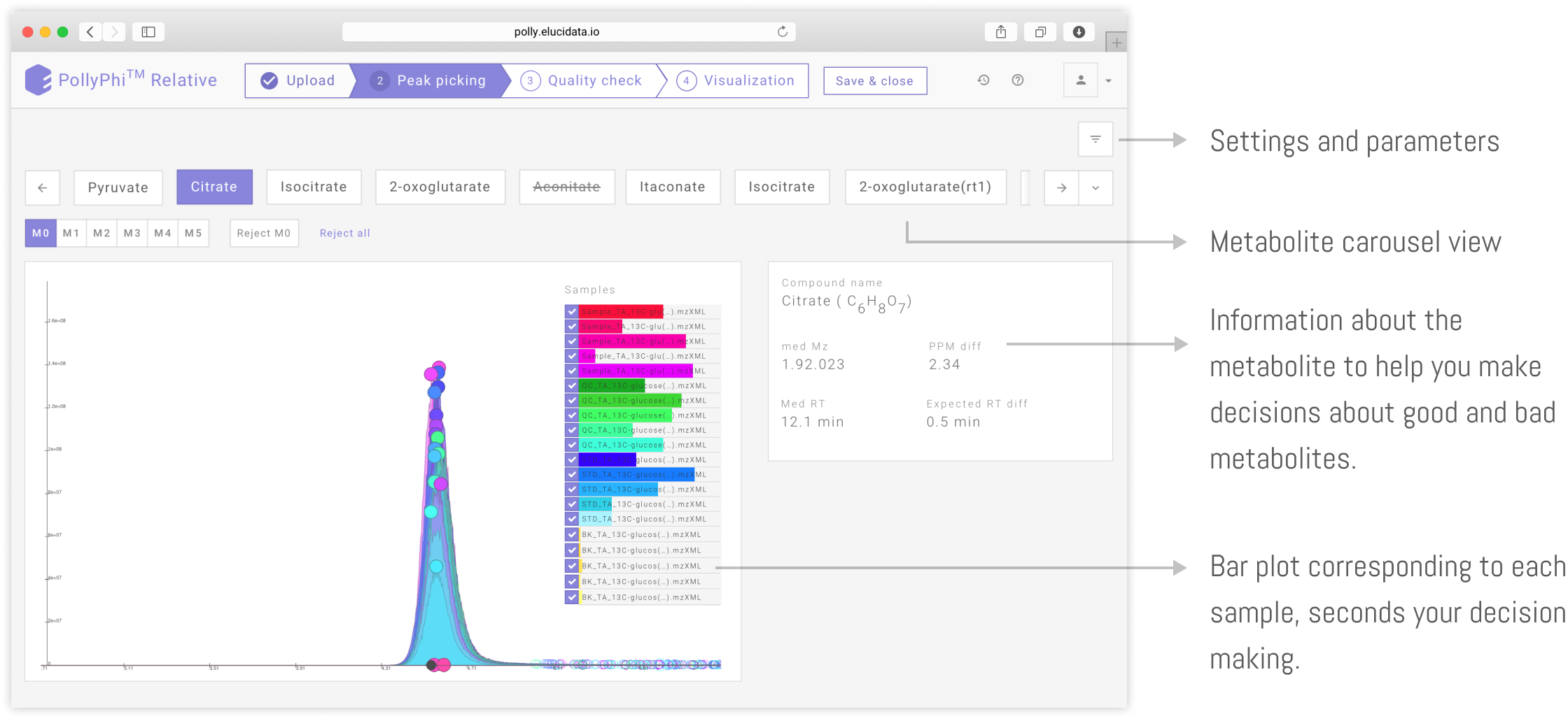
It is one of the major tasks while analyzing any metabolomic dataset. Wherein you annotate good and bad peaks. based on look of the plot, information about the metabolite, intensities in different samples etc. It requires a little expertise to curate the good and bad peaks.
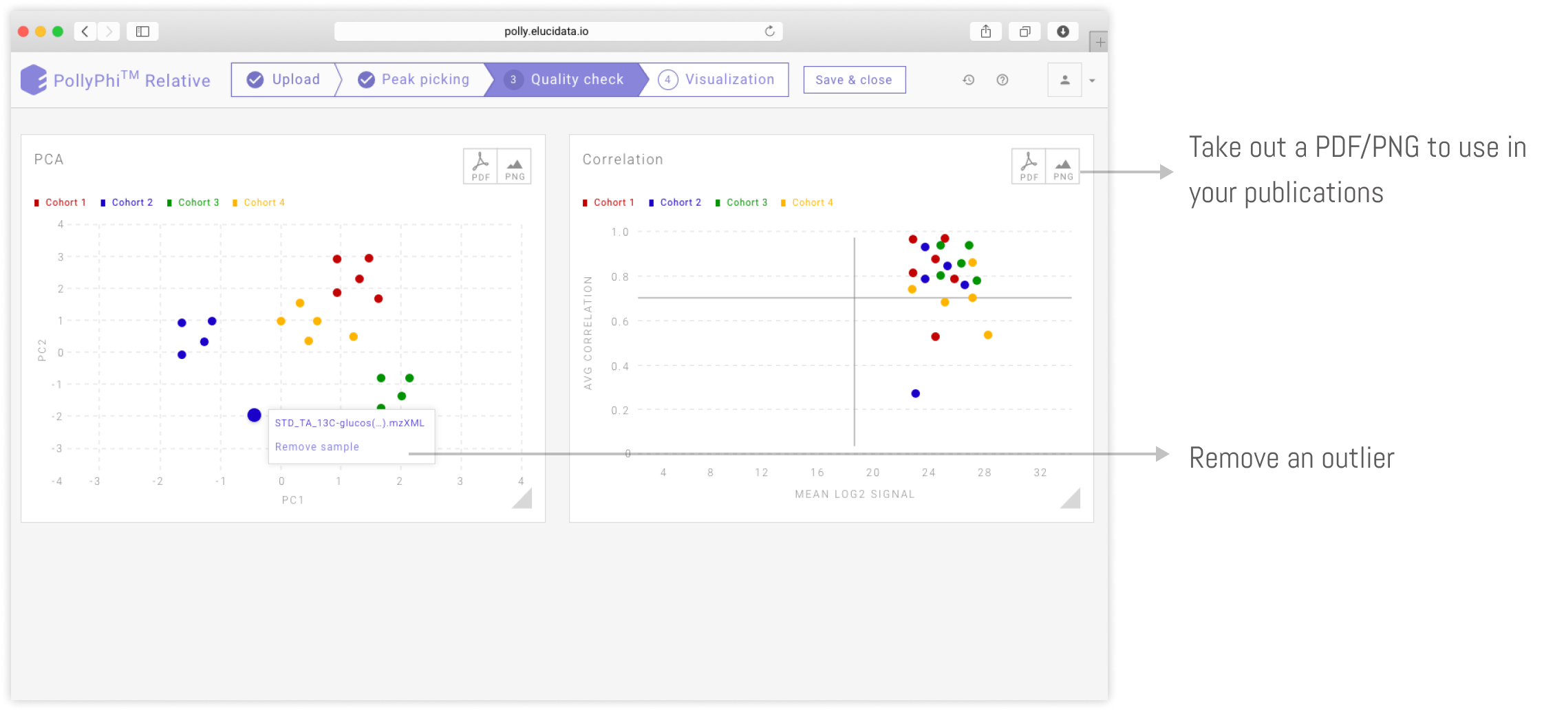
Quality check
PCA plot and correlation plot on quality check dashboard help you to check the data present in the sample files and find the outliers which might be feeding noise in your data. You can reject an outliers from the dashboard and proceed ahead to visualization dashboard
Pathway visualization dashboard
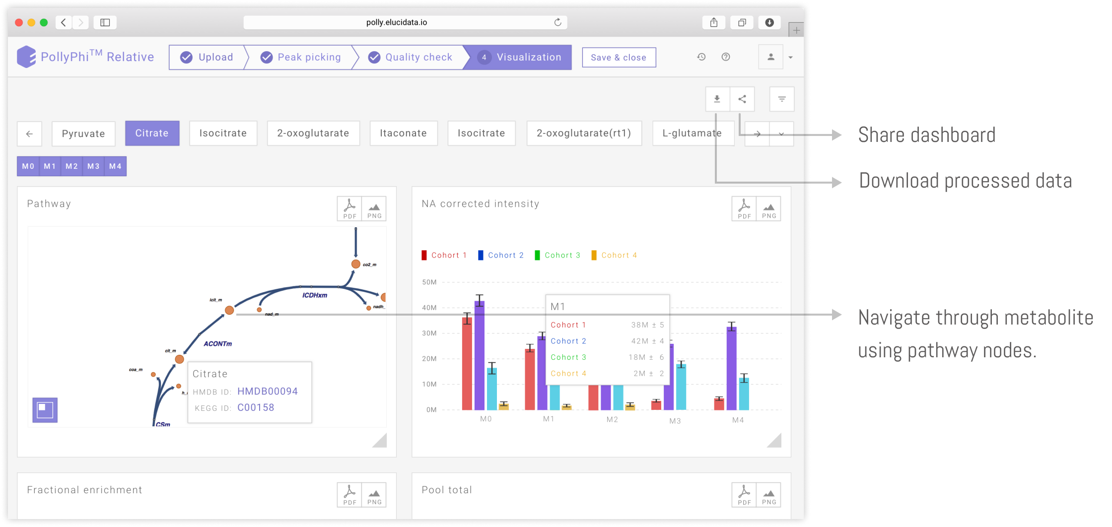
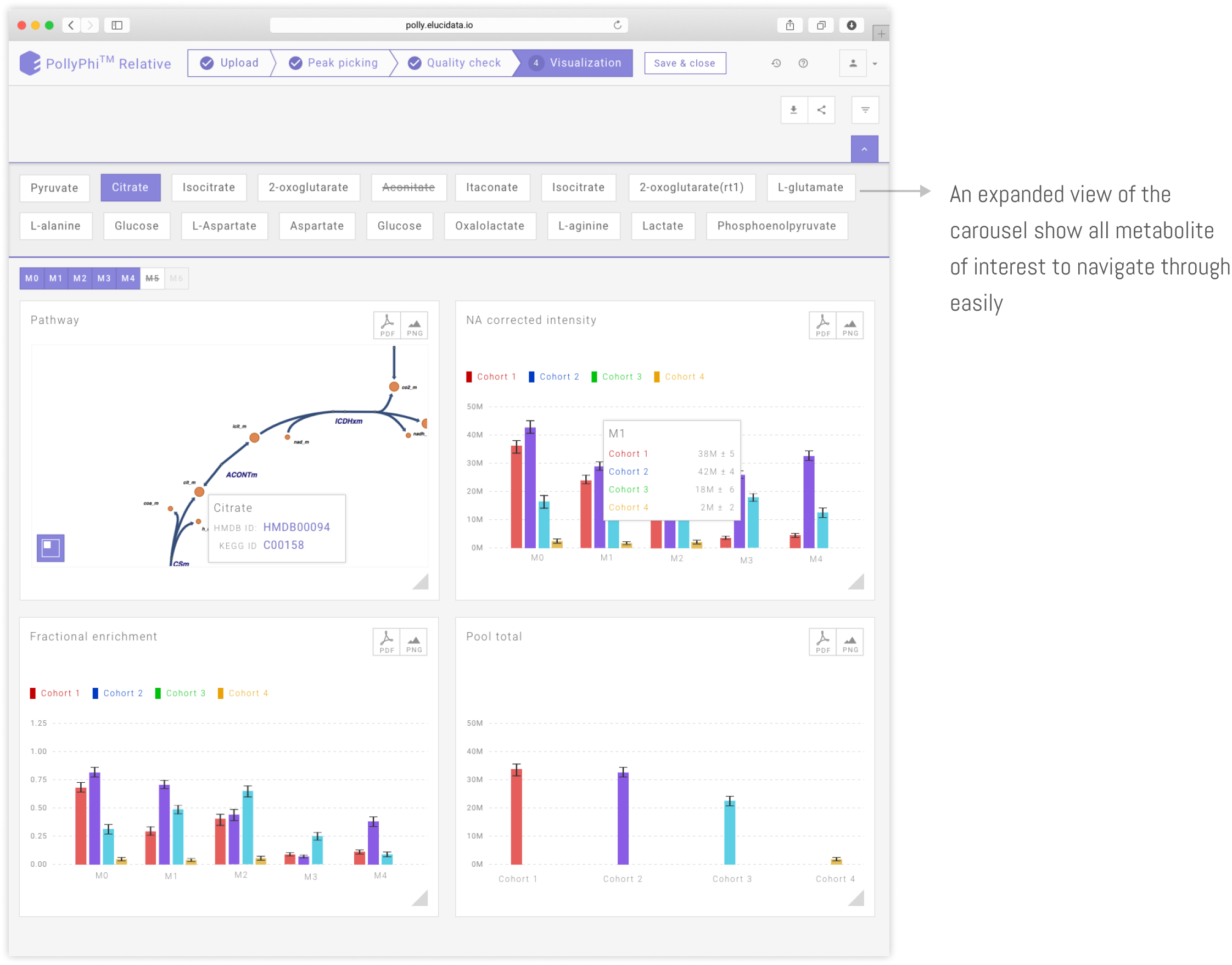
Knowing the traffic without the location or the route, makes no sense. Our users have to take out the processed data and put into other visualizations tools to visualize data. Even then the context is lost. Because of the pathways. Having a pathway alongside the visualizations adds another level of fidelity in analyzing the dataset. It helps you see the traffic in context with route and location.
