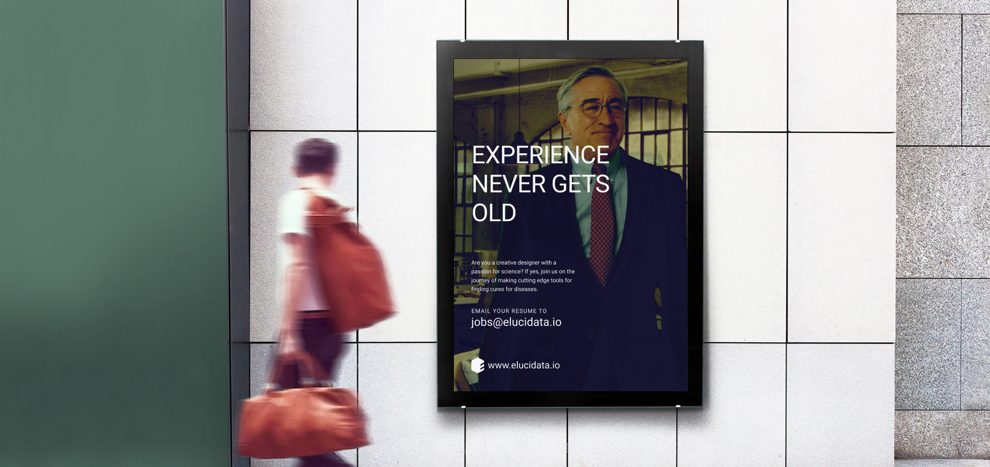
Elucidata – Identity & Branding
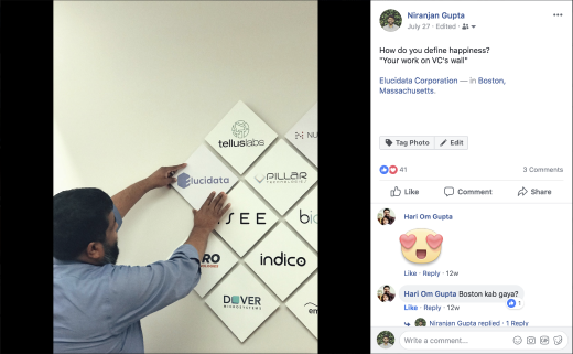
Fresh me, ready to put a dent in Biotech

About
Elucidata is a Biotech company which enables scientists to find drug target, during the early stage of a drug discovery process. It does so by bringing insights from experiments carried out by scientists at different labs, academic institutions, and pharmaceutical companies. Its product, PollyTM is one stop solutions for analyzing Metabolomic data. They are also planning to foray into other Omics data. Check out their website for more product updates.
Visit websiteGoal
Create an easily recognizable identity which works on Digital and Physical media in all forms and shape.
My role
Art Direction
Graphic Design
Team
Designer
Founder
Co-founder
Design mentor
Tools
Figma
Illustrator
Duration
2 Weeks
Challenges
Existence
Very few people knew about us.
Work clarity
Very few people understood the kind of work we were doing.
Trust
Potential hires and clients struggled to trust the company and our offerings.
Naive
We looked like a naive company. Even though our offerings were used by big pharma companies.
Birth of Elucidata identity
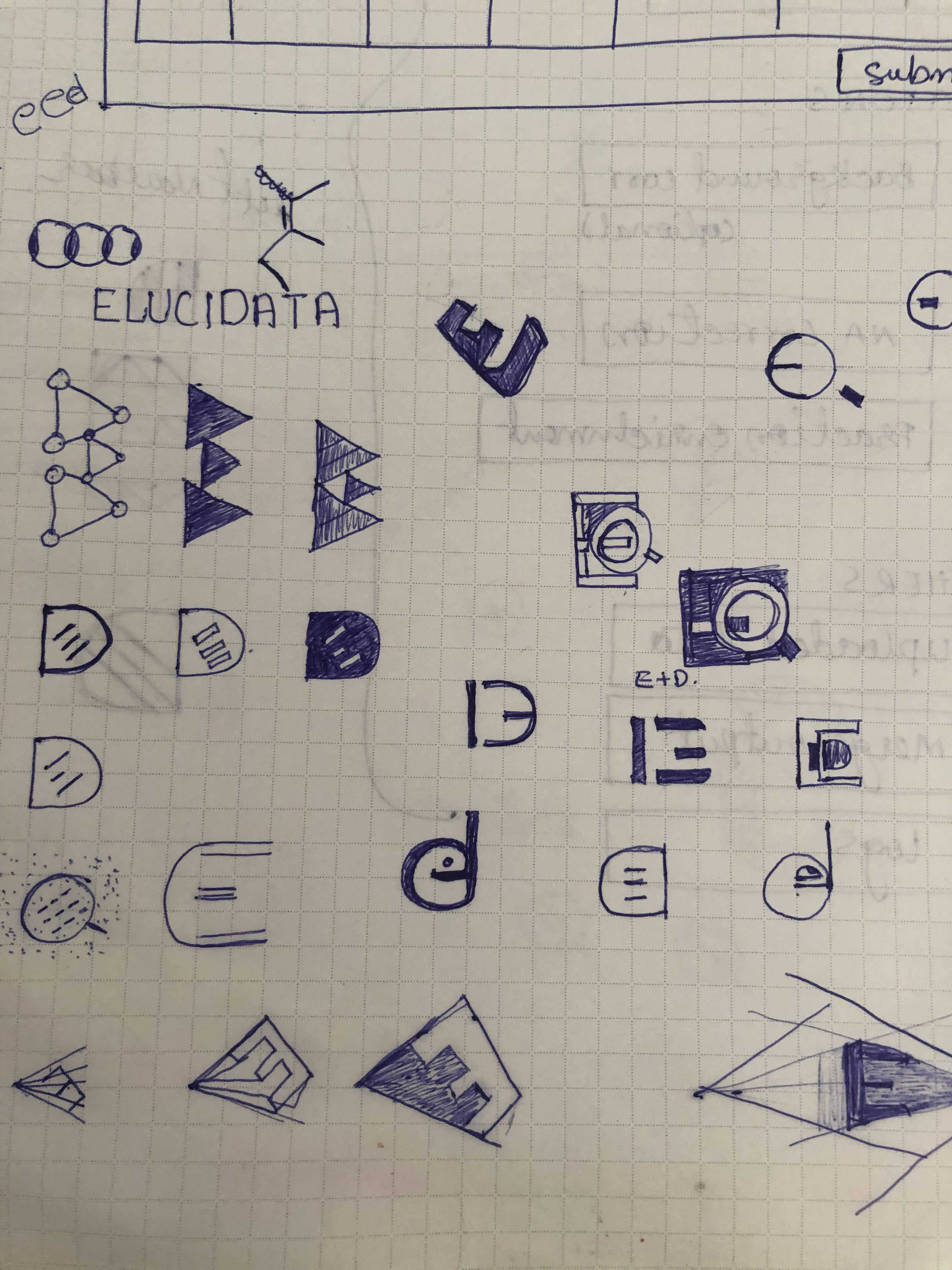
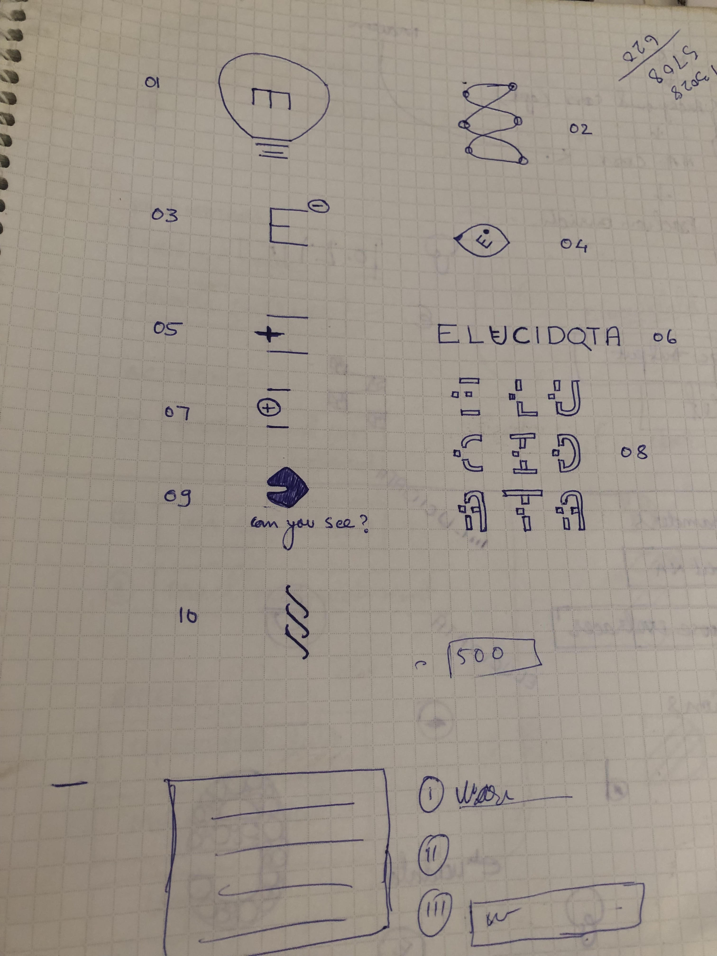
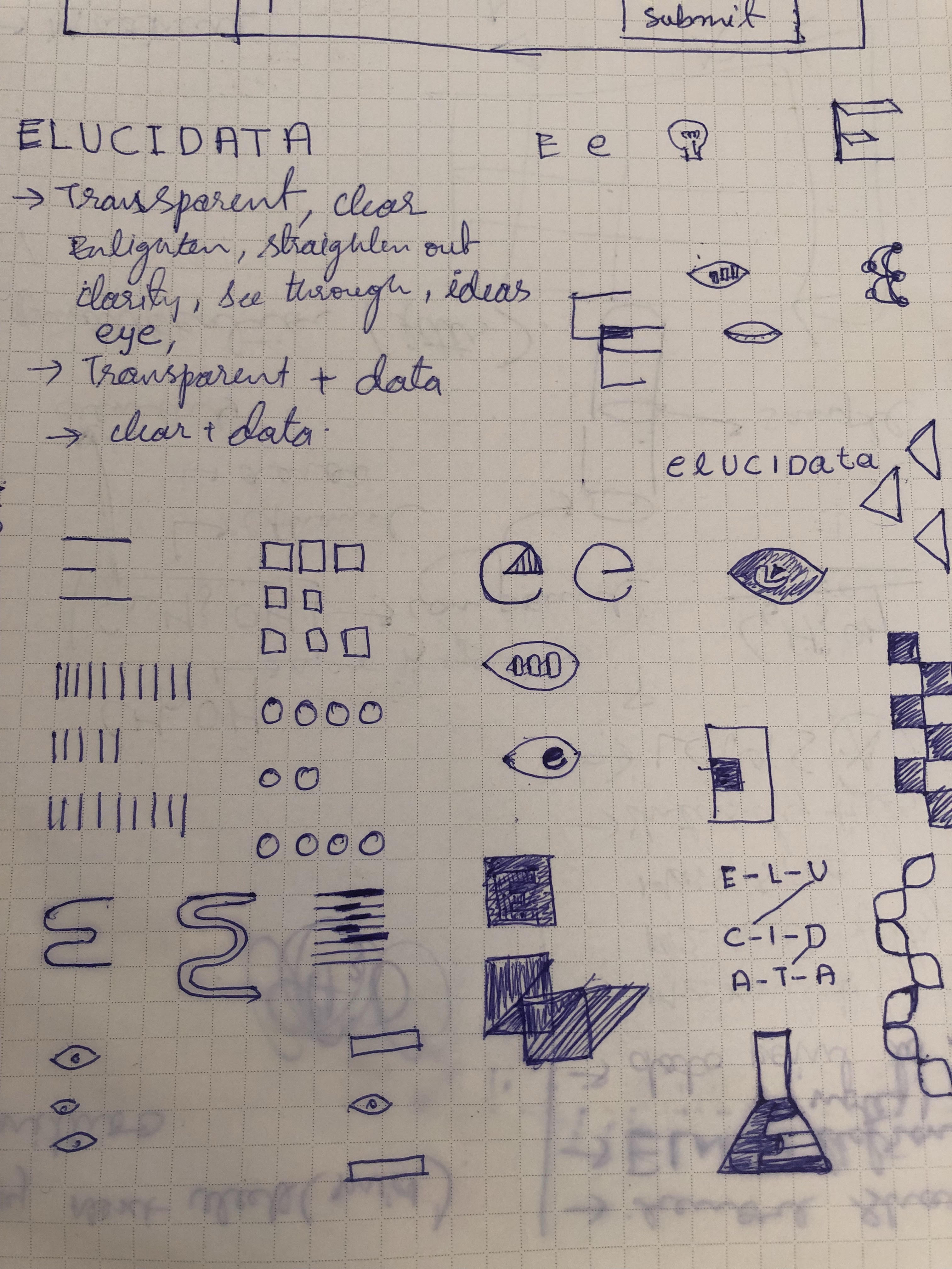
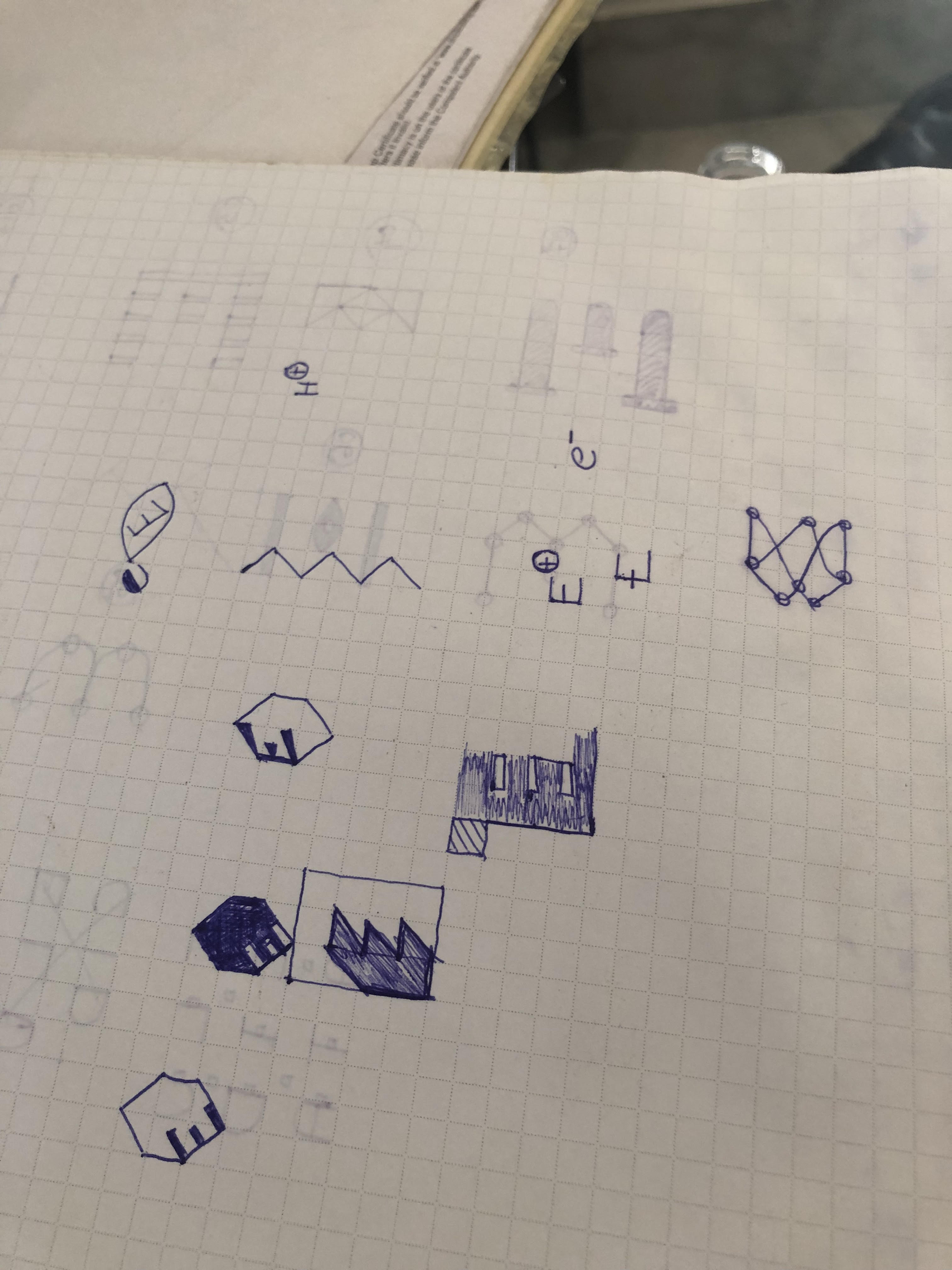
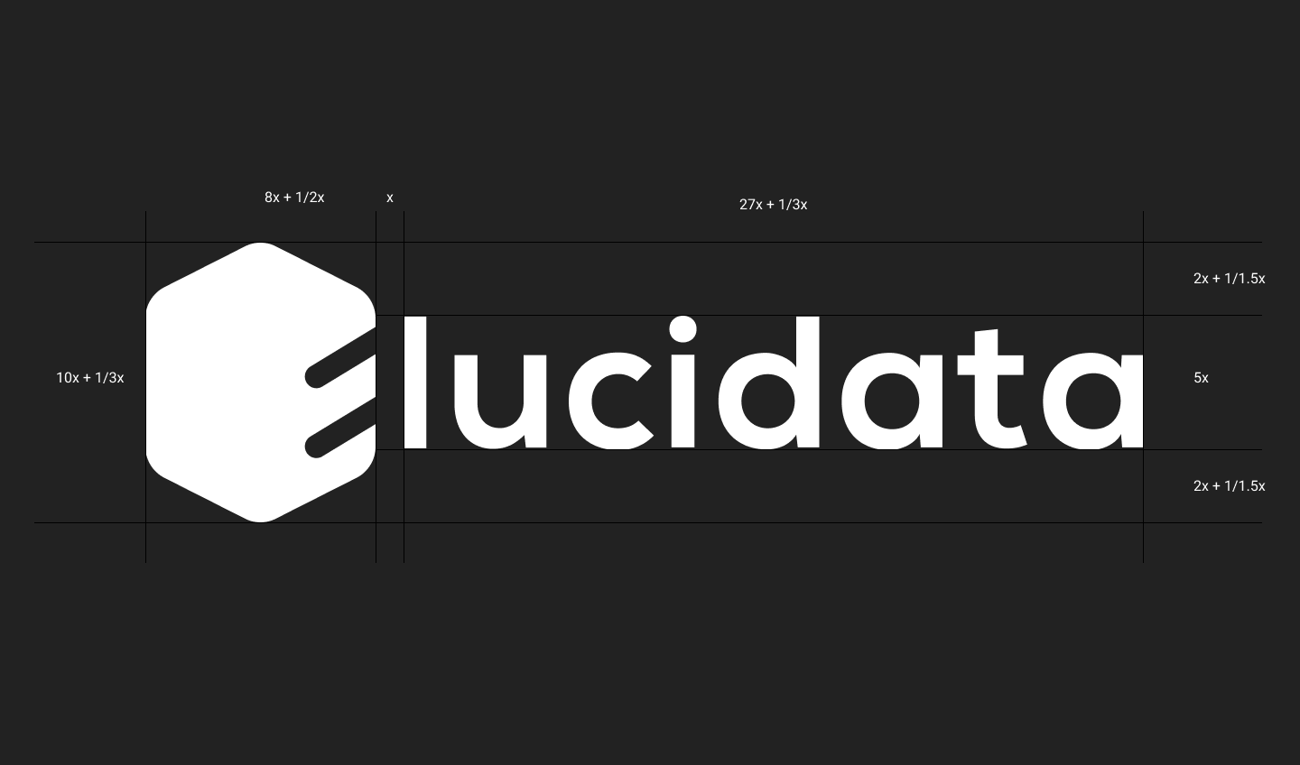
After trying a lot of ideas, we choose to go with the Benzene structure and made a dent into it to create “E” for the Elucidata. The benzene ring is a very known and easily recognizable compound to both the persona( potential hires and clients ). Benzene depicts the stability and its sharp edges in the figure depict the cutting edge technology that Elucidata works on.
Typography
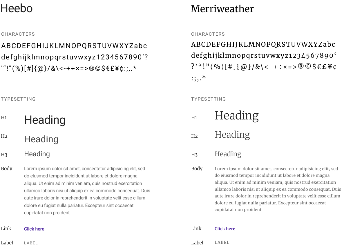
I went through various typefaces on google fonts, as I wanted to pick a unique sans-serif typeface for UI of the product and Serif typeface for the content-heavy pages. Like Website, Blogs, Letterhead, Slides, etc. I choose Heebo and Merriweather. Heebo is an optically corrected typeface which is similar to Roboto. You will notice the difference only in use. It gave the product a unique personality and fulfilled all the need of any professional quality typeface. Merriweather, on the other hand, gelled perfectly with it and looked beautiful at all different sizes.
Brand colors
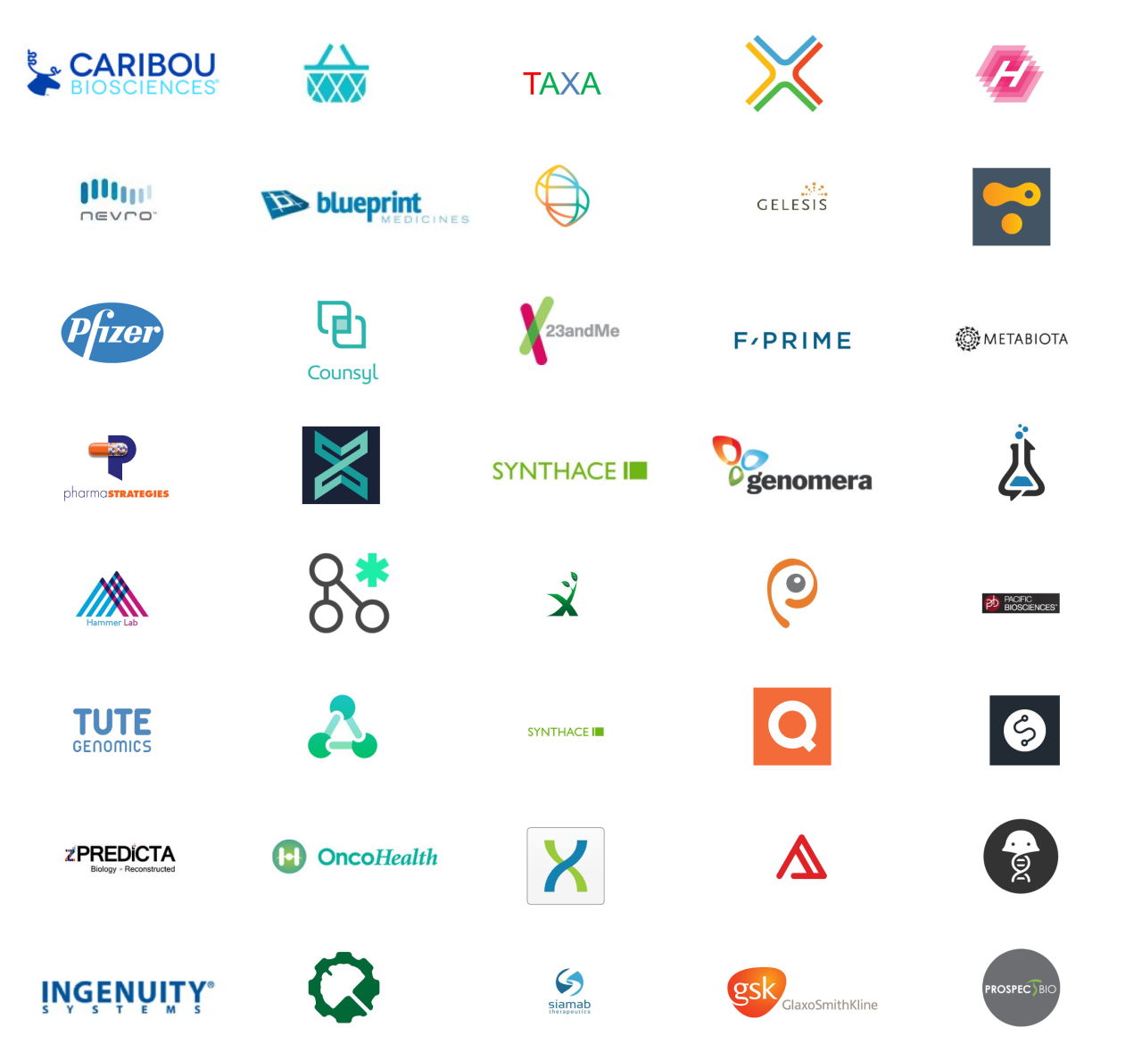
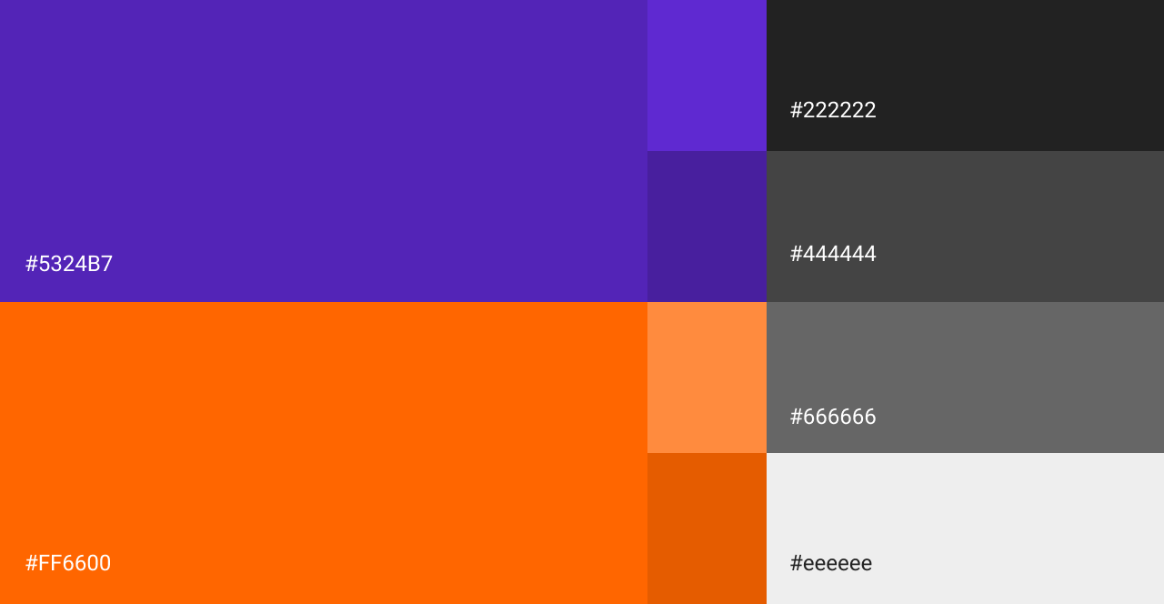
During our discussion the stakeholders wanted the brand to speak for simplicity, seriousness, trust, cutting edge and freshness. To achieve this I looked at more than 100 Biotech companies on Angellist and observed that there were very few companies which were using shades of purple. As purple closely resembles most of the words above. After trying out different contrasts and shades of purple. We settled down with the below palette.

How does it look on different platforms?
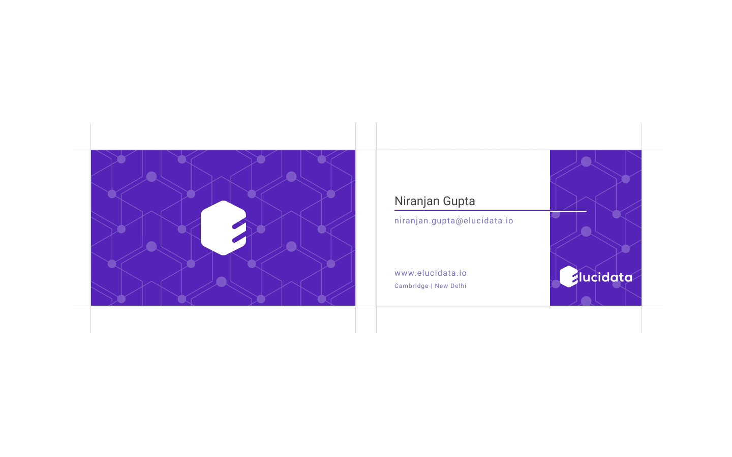
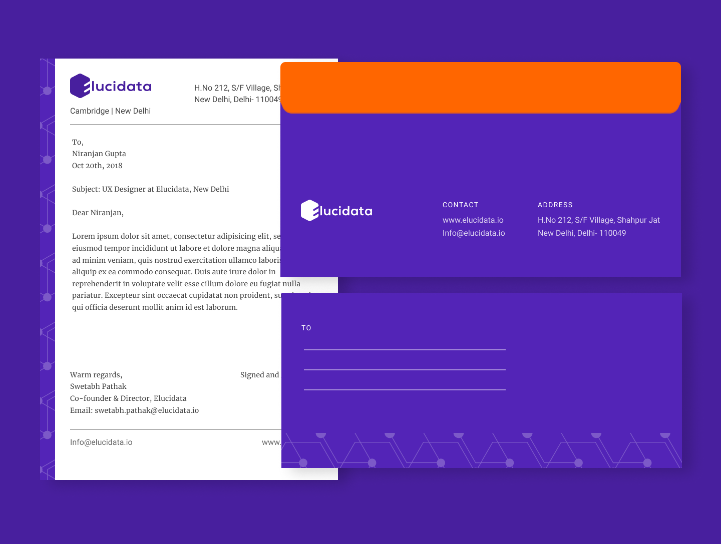
Well, It perfectly gels on all the platforms.
Learnings
Inclusion
This project helped me understand the value of inclusion from different stakeholders. As their feedback were helpful in finalizing the design. Once the logo was finalized. We showed it to everyone and asked for their feedback. Most of them liked it and wanted to know the rationale behind the choice of color, font, and shape, etc. This exercise sparked a dialog between the teams and we had some fresh suggestions. Out of which a few made to our final tweaks.
Brand strategy
I learned about brand strategy in the process of designing the logo. My mentor helped me see the bigger picture of the project, and helped me answer the questions like "How will the logo be used in a certain context?" We primarily focused on Print and Digital media. In Print we had to consider the design of product sheets, leaflets, scientific posters, visiting card and in Digital media we had website, product, social media, emailers, slides, and design system, etc.
